Sunday 30 November 2014

My Collection: Thermals

I'm back! I took 2 weeks off because I had my mock exams and lots to sort out family-wise. Today I'm here with my thermal collection so far.  I took these pictures a while ago now so my nails are a little bit longer. 

I got my first thermal in a nail mail last year and I've been in love since. I don't have many and I envy those who own thousands, but this is my little collection. I've also done macros to try and show the transition. Remember that thermals lose their 'changing ability' after around a year, so if you buy one make sure to use it lots within that time.


First up is Liquid Sky Lacquer's 'Are You A Good Witch?' and this was my first thermal. It goes from pink (warm) to purple (cold) and lots of shades of both colours depending on the temperature- it's very sensitive. It is also a holo which makes it even better! I will always love this one. 


Next up, Liquid Sky Lacquer's 'Just Lucky'. I also got this one in a nail mail after putting '24 Karat Rose' on my wishlist. This one has a similar effect but is less pink. There are tiny gold glitters in this polish, which goes from red (cold) to nude/clear (warm). It is the most 'dramatic' changing thermal- as in it goes to a completely different colour. I love this one because it goes from a subtle look to a gorgeous bright red as soon as I step outside, especially in the winter.


Luscious Potion's 'Sunshine Orchid' is next. It's a mini bottle that I got free with a destash order- the only one I own not from a nail mail. It goes from a dusky orange (cold) to a dusky yellow (warm), but it's starting to lose it's thermal 'power' and now it barely changes, which is why the macro doesn't show the transition very well. 


Next is F.U.N. Lacquer's 'Purfect For Me', which is also a mini. I got this one in a nail mail too in an Easter swap on Instagram. It is the only thermal I own that doesn't work with a topcoat, but I'm not sure why. It has a satin-like finish and has a slight silver shimmer. It goes from a dark but bright purple (cold) to an icy blue (warm), which reminds me of the film Frozen.


The only Polish By KPT I own is a thermal called 'Permanganate'. It goes from an icy sheer white/clear colour (warm) to a dark purple (cold) and is also very sensitive which makes it all the better because I get an almost instant change when I go outside. 


Last but not least is Liquid Sky Lacquer's 'Wine and Roses'. This goes from a reddy-orange (I've only seen a pure red once when the water was almost burning hot) to a dark chocolatey brown. This is a holo and it's perfect for autumn, which is when I wear it most.


Tuesday 11 November 2014

Tutorial Tuesdays: How To Take A Good Nail Picture

Now, I'm most definitely not an expert when it comes to taking a good nail photo, and mine could still do with improvement (a decent camera for a start), but I have picked up a lot of tips along my way that have made my nail pictures better.

This is one of my favourite recent manis that I posted on my Instagram page, and I think I captured the design well. I'll go through the steps I take to get the best picture possible with the resources I have. 


STEP 1: Don't have your nails too close to the camera (unless you are doing a macro or close up). Having your hand too close to the camera is likely to make the picture blurry and your followers/readers may not be able to see the whole design properly or at all, which is a bummer.


 STEP 2: Don't have your nails too far away from the camera. Again, this can make the picture blurry, but even if it does focus you won't show your nails at their best. You need to find a mid-point that shows off your beautiful nail designs and also allows your camera to focus properly. I find it best to take a few pictures and then go through them, deleting the 'not good enough' ones and then choosing from the decent ones. 


STEP 3: Check your lighting. This is possibly the most important thing to think about when it comes to nail pictures. If your lighting isn't right, your nails won't look right- simple. This is the worst lighting I could get in my house without it being pitch black, so it may be a bit extreme but it gives you an idea. With the poor lighting, you can't see the design on the nail, and there is no way you will give a true representation of colour, effect etc. of the polish if your lighting isn't right. This doesn't just include dark lighting, you can also have bad artificial lights, so try to get daylight pictures as much as you can. 


STEP 4: Get your pose right. If you have a funny pose, your nails just won't look right. The most common poses include ones with one of the bottles used (below), a similar pose without the bottle and a pose with your 4 fingers almost 'lined up' along an invisible horizontal line (I'm not sure how else to explain that one). Whichever works best for you, use it. I change it up personally, but if you want to have a permanent pose (or even create your own) then that's a good thing to do too. Take all of these points into account when you take your next nail picture and see the difference it makes. 


Sunday 9 November 2014

My Collection: 2014 Glamour Magazine Nails Inc Polishes

It's that time of the week again, and this week I've swatched the new Nails Inc Glamour shades. There are 4 to collect and the magazine is £2, so £8 for £44 worth of polish is an amazing deal! I did these swatches at around half 7 this morning because I couldn't sleep, so the lighting isn't brilliant but I've tried to capture the true colour of the polishes the best I could. My matte topcoat is running out and starting to go gloopy so the matte pictures aren't as 'matted' as they could be, but it should give you an idea of how they look with a matte topcoat. 


First up is Marylebone Mews, which is a lilac grey polish. This one is my favourite as I'm really into grey colours at the minute. This is the lightest colour and definitely needs 2 coats, but it is so beautiful! I'll be using this lots. The first picture is with a usual topcoat, and the other is the polish mattified. I love it both ways, but I think the mattified version is more on-trend for this time of year so I'm likely to wear it like this more over the next few months. 


Next up is the darkest colour of the collection, Hanover Square. This is a deep red with purple tones. I have a couple of colours that are similar to this so I'm not sure how much I'll use it, but it was definitely worth the £2 I paid for it. Again, the first picture is with a usual topcoat, and the other is the polish 'mattified'. 


The next polish in this collection is a gorgeous purple called Wigmore Street. I don't have any purples in this shade so I'll be using it a lot, especially as it's the perfect autumnal purple. I'm likely to use this with grey polishes for nail art as I think they'd go well together. Again, the first picture is with a usual topcoat, and the other is the polish 'mattified', but I've also taken a picture with the flash on, which shows the more purple tones in this polish. Note that it does look more like the 'normal' pictures than it does on the flash.  (The flash makes my skin look an awful colour and shows up my lack of clean-up, but the colour looks gorgeous in it.)


Finally is Tate, which is another red in the collection. It is lighter than Hanover Square and so can be used more all year round. Again, I have similar colours to this so I'm not sure how much I'll use it, but it is really beautiful and completely worth £2. Again, the first picture is with a usual topcoat, and the other is the polish 'mattified'. 


Tuesday 4 November 2014

Tutorial Tuesdays: Halloween Mix and Match

Halloween has gone, but it'll be back again before you know it. So to get super prepared or just to have something to come back to next year, I'm posting the tutorial for the nails I did in the Instagram #halloweencollab2014. There were 6 of us in total and we all came up with a nail design each (I joined with Hannah- @n3wbie_nails) and posted the collage on Friday. 

There are 6 parts to this tutorial- each nail and then the clean up. Some have more steps than others, and one of the pictures for the ring finger went missing, but I'll explain the missing step later on. 

Part 1-The Thumb 

Step 1 of the thumb's spider web design is the base. I used a coat of black, then put Orly's RIP over the top (it's too sheer alone)


The next step is to do the lines for the web. I did one horizontally, one vertically (an upside down 'L') and then one diagonally from the corner. I used a white nail art polish and a dotting tool because my white striper has seen better days.


Finally, join the parts of the web together. Make small almost-semi circle shapes to join each line, like the 'bumps' on a letter 'm'. I did this twice as my web lines were small, but you can do it across your whole nail for a more detailed effect. 


Part 2- The Index Finger

For the base of this nail, I used Orly's In The Navy. I only used one coat and it dries really quickly- I really should use it more often!


Next, I did the outline of the tree. I used Ciate's Cream Soda (a light grey) to add a moonlit effect to the overall design. Again, I used a dotting tool to create this design.


Finally, I went over the tree with a black polish. I left tiny bits of the grey on show to better define the tree and to add the moonlit effect I was on about above. 


Part 3- The Middle Finger

This was 'my' nail that Hannah and I came up with- a bloody fingerprint. I did a base of newspaper print (using NO alcohol) to give it a more 'crime scene' effect, but when it came to it, the print covered most of the paper so this is optional. You could do the newspaper print and splatter 'blood' or do the print more off-centred so that both are more apparent. 

For the base, I used 1 thin coat of Nails Inc's 'The Perfect Nude' in Eaton Terrace.


Next up, the newspaper. I dipped the paper in water for around 20 seconds (almost like a decal) and pressed it onto my nail firmly. 


Afterwards, I removed the paper carefully to reveal the design. Topcoat this nail almost straight away, because the print will just wipe off otherwise. 


After this, I did the bloody fingerprint. I used Rimmel's Redder Than Red and painted thickly over my finger.  I pressed my finger over some paper a couple of times to remove excess before using it on my nail. 

To put the print onto my finger, I pressed from left to right, like how you'd move a stamping plate. It also dried almost instantly like stamping so make sure you do it quickly. 


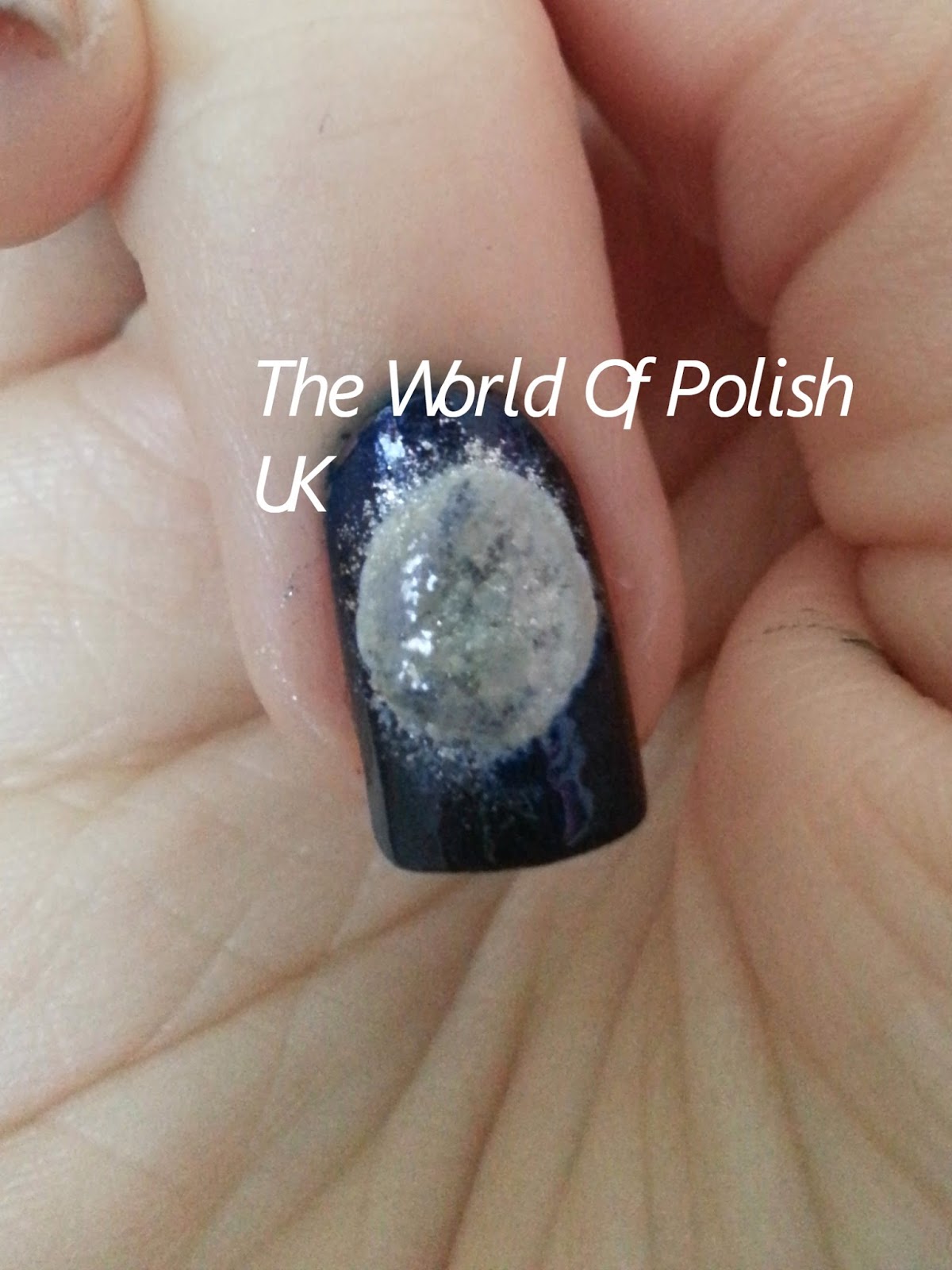
Part 4- The Ring Finger

For the base of this cat and moon nail, I used Orly's In The Navy like I did on my index- it gives the perfect amount of shimmer for a night time sky. 


Next, I did the moon. I used a dotting tool, and managed to get some blue on it because I did it before the blue was fully dry, but it gets covered in the next step. 


After making the outline, I sponged over the white with grey and silver, letting the silver go slightly outside of the shape to give the impression of moonlight


Next, I started the body of my cat. I made a 'carrot' shape and the widened and squared off the bottom where the feet will go. 


This next step may be a bit complicated, because I lost all of the other steps as mentioned at the start. First, add the cat's head (a simple large dot). Then, add the ears with your smallest dotting tool making two tiny triangles. 

Then, for the legs, make a small 'butterfly' shape at the base of the body to make the silhouette for the bent 'sitting down' legs of the cat. I've also lost the picture of the tail, but I just make a tail shape with my dotting tool from the middle of the 'butterfly' on one side.


Part 5- The Pinky Finger

For the mummy nail, I started with the same base as my middle- Nails Inc's Eaton Terrace. I only did a thin layer because there is going to be some layering in the next step. 


For the bandage effect, I sponged my base colour along with a light brown (Barry M's Mushroom) and a darker sandy nude (Sally Hansen's Quick Sand). Whilst it was still partly wet, I dabbed my finger onto the nail to add texture. 


To make the 'opening' where the eyes are, I used She Sells Seashells' straight vinyls to get perfect lines. To get them perfect, apply the polish and take the vinyl off quickly and carefully with tweezers. 


For the eyes, I simply used a white polish and then added red pupils to add to the theme that little bit more. Make sure the white is completely dry to avoid simply picking it up when you try to put the red on. 


Final step- The Clean Up

Topcoat your design after as long as possible to avoid smudging, then clean up with your favourite clean up brush. You now have the perfect Halloween mani to scare the night away with.


Sunday 2 November 2014

My Collection: Gel Effect Polishes

It's that time again where you get to see some of my nail polish collection. This week is gel effect polishes. I only own Barry M Gellys and Nails Inc Gel Effects and I have nowhere near the full collection of either. I'm hoping for some of both for my birthday though so maybe one day I'll be the proud owner of the full collections! I've swatched each polish alongside another 'regular' polish of a similar colour in order to show the difference between those and the gels. Note: The index and middle are the regular polish, the ring and pinky are the gel. All polishes are 2 coats with topcoat.

First up, Nails Inc West End. I paired it with Rimmel Redder Than Red. The gel is more opaque and takes a bit longer to dry, but it gives more shine than the regular polish. However, these are similar colours, so if you're on a budget and looking for the 'perfect red', go for the Rimmel and use 3 coats. 


Now for my only other Nails Inc Gel Effect- Soho Place. I paired this one with Barry M's Mint Green, which is a lighter mint than the gel. Again, the gel is more opaque, but this one takes around the same time to dry as the regular polish. I will use these both depending on my design (or maybe even together one day) as they are different shades of mint, unlike the red swatch above. 


The next 8 swatches are of my Barry M Gellys, starting with Chilli. This colour is perfect for A/W, but I think I'll also use it for nail art throughout the rest of the year. I paired this one with Nina's Cherri Berri - it was the nearest red I had to this colour. I'll definitely be using this a lot as it's the only polish I have in this sort of colour and I love how it looks.


Next up, Barry M's Blue Grape. The polish I had closest to this stunning blue was Nails Inc's Baker Street. This was one of the first Gellys I bought, on holiday in Yarmouth when they first came out. Again, it is different to anything else I own and I use it quite a lot, but overtime it's gone a bit gloopy despite using Seche Restore so I can't use it as freely as I used to- I may even re-purchase this once it becomes unusable. Even though the Gelly is darker, it takes about the same time to dry due to the consistency of the formula in my bottle- but it did used to dry a bit faster so a new bottle should dry in about the same time as a regular polish. 

Another of the newer Barry M's is Chai. This is a gorgeous mid-grey polish that I bought in my latest Barry M haul and it instantly caught my eye. I originally bought this purely for nail art, but I love it so much that I'm definitely going to be wearing it alone a lot. The polish I compared it to is Nails Inc's The Thames (my first Nails Inc), which is a few shades darker than the Gelly but just as gorgeous. The Gelly takes a bit longer to dry because it is a lighter shade, but as with the others the shine is amazing so it's worth the wait. 


Next is Barry M's Green Berry, which I've paired with Ciate's Pepperminty. This Gelly was one I also bought when they first came out because it's the perfect summer colour. It's brighter than any other mint polish I own, with more green tones- the majority of my others are blue or grey toned. I will definitely be re-purchasing this once it runs out because it's my favourite Gelly and my favourite mint polish.


Up next is Barry M's Papaya. I swatched this polish alongside Essie's Tart Deco which is very similar, just more pastel compared to Papaya's more orange tones. As with the others, the Gelly is more opaque but only just, I'd wear both with just the 2 coats. This is another of my favourites, especially as I got it for free in a nail mail- free polish is the best polish in my eyes. I won't be using this as much this season but it will definitely be coming out in the spring and I'll use it all the way through to this time next year. 


This next polish is an exact dupe of the one I swatched it with. The Gelly is Barry M's Dragon Fruit and the regular polish is Leighton Denny's Pink Promenade. They are pretty much the same colour, and even have the same shimmer in them (which is more obvious in the bottles than on the nail). The Gelly £3.99 is obviously cheaper than the LD £11, unless you get the LD on offer like I did in a set of 3 from TKMaxx for a tenner (bargain). I love both, but the LD dries that little bit faster as it is a regular polish and not a gel effect. Saying that, I use the Barry M more because it goes on easier and gives thicker and more even coats. 


Next up is Barry M's Prickly Pear. I paired this with Barry M's 'regular' lilac- Berry Ice Cream so that you can see the difference between 2 shades of the same brand. The Gelly is lighter and duller than the regular polish, but I prefer the Gellys when it comes to pastels as they are more opaque. The regular polish dries slightly faster than the Gelly, but I love both just as much. I change these up depending on the design I'm doing- the Gelly is better as a base colour or for ombre, but the regular polish is better for nail art as it doesn't get as gloopy. 


The last in my Gelly collection is Barry M's Elderberry. I paired it with what I thought was a similar colour when I looked at the bottles- OPI's Even Royals Get The Blues. Both polishes have a grey tone to them, and in the artificial light they looked similar. However, when I woke up and went to take a picture, I realised the OPI is a lot darker. The OPI dries quicker, but I like the colour of the Gelly more. Additionally, the OPI is a mini so I prefer the brush that the Gelly has, but both are gorgeous colours.